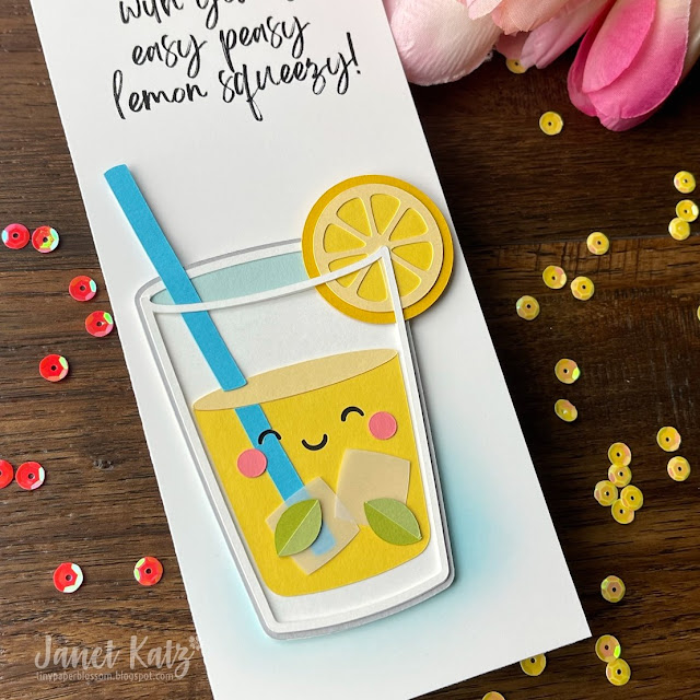
I love a good challenge (or 3, or 5) and the one at As You See It Challenge blog was too good to pass up. The theme for Challenge #276 is "Here's to Beverages." Now, there's a topic I virtually never touch. I don't own any coffee, tea, cocktail, beer, or canned beverage stamps or dies. I might have a piece of scrapbook paper but I'd have to search. In times like this I turn to Silhouette Design Store. I found a fantastic paper-pieced image by Doodlebug Design. I created it with a LOT of Stampin' Up! cardstock including Daffodil Delight, Tempting Turquoise, So Saffron, Flirty Flamingo, Pear Pizazz and a few others. Heavy vellum from Amazon made the ice cubes. It took less time to assemble than I guessed and I sized it to fit on the bottom of a vertical slimline panel 3.5" x 8.5".
At the top I really wanted the sentiment of "Being friends with you is easy peasy lemon squeezy." Naturally, I didn't have a stamp on hand for that. I turned to MS Word, but I couldn't find a font that was just what I wanted. Next, I turned to the online site Canva. I discovered a wonderful, swooshy, handwritten font called Brightwall. I typed my phrase on a white background and then saved it as a .png file. As I had chosen a white cardstock to print it on, the white background couldn't stand out. I ran it through my laser printer (bought used on FB Marketplace to use for printing on cardstock) and then cut it into the slimline panel shape.
Next, I took a small blending brush and Tumbled Glass Distress Ink and created a blue glow at the bottom of the piece for the glass to sit on. I used foam adhesive to pop up the lemonade and I was finished. It was relatively easy peasy lemon squeezy! I am also entering this at the Simon Says Stamp Wednesday Challenge Blog where the theme is bright and cheerful.
I found a unique challenge at Double D Challenges to use white plus just one other color in your card. It didn't say monochrome -- just one other color. I love scene cards and realized it had been awhile since I had used this Mama Elephant Window Dressings Die set. It comes with so many different dies including windows, panels, curtains, butterflies, flowers and a flower box.
The birds are Poppystamps Whittle Birds die set. I love how detailed these are. Using Stampin' Up! Calypso Coral cardstock and Designer Series Paper (retired) and Neenah 110lb Classic Crest Solar White cardstock, I was able to pull off the challenge requirements.
I am also entering this at Simon Says Stamp Wednesday Challenge (using a little critter). And Addicted to Stamps #430 (using die cuts or stencils).
Once again, the sentiment is computer-generated using a font called Posterama.
Do you enjoy making "a scene" on a card?
I'm over on the Poppystamps Blog today with a reminder to enter their monthly challenge. This month the focus is on birthday cards. It doesn't have to be a card. Just use at least one Poppystamps product and enter here.
Oh, how I'd love to float in a pool with beautiful flowers all around. But winter has finally struck Texas, so I'll let this little otter do it for me. I started with this sweet whittle girl and put her on the Whittle Wave background. It was super simple to cut two wave backgrounds and snip the cuts in a darker blue and place them on top of sections of a lighter one. To give a more springtime feel, I added flowers from the Floral Cluster die (I use this thing ALL the time) and colored the center of the flowers with a white gel pen.
Next I wanted to add layers and frames and repeat the colors I had already used. I added little scraps of patterned paper as well as two kinds of frames. I used the same brown paper as the otter and cut the Whittle Wood Frame and used it as a layer. I cut the Double Scalloped Stitched Frame from white and used it on top of the same dark blue I used on the wave background. When you keep your color scheme to just a few colors and repeat those colors, you get a very cohesive-looking design - and it saves trips to your paper stash.
I added some tiny staples with the Tim Holtz Tiny Attacher and some baker's twine and played with the paper "stack" until I liked it. I put it all onto a white card and added a sentiment that I computer printed. This card was a lot of fun to put together. I'm certain I will use this "stacked" approach again.
Ingredients
CS: Neenah Solar White 110lb, Memory Box Ocean Blue 6x6 pad, Memory Box Earth Neutrals 6x6 pad, Stampin' Up! Pink Pirouette and Calypso Coral
Patterned Paper: MFT Tiny Check 6x6 Paper pad
Sentiment: computer printed using DK Lemon Yellow Sun font
Dies: All Poppystamps: Whittle Otter, Floral Cluster, Whittle Wave Background, Double Scalloped Stitched Frames, Whittle Wood Picture Frames
Embellishments: Tim Holtz Tiny Attacher, Baker's Twine
I was thrilled to have my card chosen by the Color Hues Color Challenge as the winner of their 24th challenge with my Coral & Turquoise card. As a result, they have graciously asked me to be the guest designer for challenge #26. Pink and purple are the challenge colors, and they are not just for unicorns and Disney princesses anymore. When I think of these two colors, I think of flowers. My husband loves to grow flowers in our backyard and lilies in our koi pond and they are most often pink and purple. I recently purchased a gorgeous 6x6" background stamp from My Favorite Things called Roses All Over Background. It is stunning, and a big departure from the adorable animal stamps I know them for. It is not new in their catalog; I've simply never seen it until recently. I stamped this on watercolor paper with Versamark (I got the best results from putting the paper down onto the stamp and pressing) and then heat embossing in white. I used only 2 of my Zig Clean Color Real Brush markers to put the color down. Then I used a water brush to spread it onto the rose pattern, even blending a little here and there.
To let the beauty of the stamp and the colors shine through (and to not stray from pink and purple), I kept the sentiment short, sweet, and black and white. It needed more than a stamped phrase, but not much more. I don't yet own any script dies (soon, I promise), so I used my Silhouette. I used the Silhouette's offset feature to get the black background. I pop dotted everything off a white background and I was done. The card will fit into a 5.5" square envelope.
CS: Gina K Pure Luxury Heavy Weight 110lb, Canson XL cold press watercolor paper, Bazzill Licorice Twist
Ink: Versamark
Die: Silhouette used with font Bigfat Script from Fontspace.com
Embossing Powder: Taylored Expressions Fine Detail White Embossing Powder
Watercolor: Zig Clean Color Real Brush Markers in Lilac 080 and Pink 025; Pentel waterbrush with largest tip
I love watercolor a lot, but sometimes it intimidates me. So when I had the idea to simply combine 3 colors (red, orange, purple) in a messy way, I knew it wouldn't be too hard. I used my Zig Clean Color Real Brush Markers in a couple of orange, a couple of red, and a couple of purple shades. Then I used a large Pentel waterbrush, I simply spread the color over some watercolor paper, making sure to avoid mixing blue-purple with orange as I knew that would not blend too well (they are too close to opposites on the color wheel). I kept red in the middle of the other colors. I literally painted with one color a little with the marker, then spread it with the waterbrush. I kept going until I had covered an area about 8" x 3". Then I sent the watercolor paper through my Silhouette and cut the word "wish." Then I cut BIG out and painted it with one shade of purple after it was cut. I overlapped the letters and added pop dots to the w and the s. I added several sequins and called it a day.
CS: Background is Gina K Pure Luxury Heavyweight 110lb, Watercolor cardstock is Canson XL Cold press
Watercolor markers: Zig Clean Color Real Brush markers in Red, Geranium Red, Wine Red, Carmine Red, Deep Red, Scarlet Red, Orange, Purple, Violet, and Deep Violet
Pentel Waterbrush, largest size
Fonts used in Silhouette: Tondu and Bebas Neue found on DaFont.com.
Sequins from Amazon.com.
Challenges: CAS Mixup September Watercolour Challenge, Happy Little Stampers Anything Goes with a Die, Happy Little Stampers Watercolor Anything Goes, Color Throwdown 659, Simon Says Stamp Wednesday Challenge: Sparkle & Shine


Social Icons