

There is nothing quite as sweet as the images by Anita Jeram for Colorado Craft Company. I pulled out these Tea Time sweeties to enter the Color Throwdown Challenge #743. Lime, Pink and White are the colors required with neutrals (gray here) allowed. I am also entering the Art Impressions Challenge. I made a video of putting together this card including all my coloring and I plan to edit it to use as an Instagram reel in the coming days. My files are larger than normal because I just left my phone recording the entire time I was coloring all the images. Gonna be a bugger to edit. (Edit: Video is finished and on my reels on IG @tinypaperblossom.)

I colored all the images with alcohol markers by Copic, Dick Blick, and Spectrum Noir. I cut them out with the matching dies. Next, I used Sweetly Stitched Shapes dies from Stampin' Up! to cut out all the stitched circles from old Stampin' Up! and Jillibean Soup paper. I used a die from the Mama Elephant Window Dressings die set to cut the white panel. I used plenty of foam adhesive to build the dimension on this card. Finally, I used a sentiment from My Favorite Things Birdie Brown's Greetings Galore attached with the Tim Holtz Tiny Attacher. I made the fishtail with a small square punch.
I have many more images from Colorado Craft Company and Anita Jeram colored; I just need to make them into cards.
Have a great day!
There is nothing quite as sweet as the images by Anita Jeram for Colorado Craft Company. I pulled out these Tea Time sweeties to enter the Color Throwdown Challenge #743. Lime, Pink and White are the colors required with neutrals (gray here) allowed. I am also entering the Art Impressions Challenge. I made a video of putting together this card including all my coloring and I plan to edit it to use as an Instagram reel in the coming days. My files are larger than normal because I just left my phone recording the entire time I was coloring all the images. Gonna be a bugger to edit. (Edit: Video is finished and on my reels on IG @tinypaperblossom.)
I colored all the images with alcohol markers by Copic, Dick Blick, and Spectrum Noir. I cut them out with the matching dies. Next, I used Sweetly Stitched Shapes dies from Stampin' Up! to cut out all the stitched circles from old Stampin' Up! and Jillibean Soup paper. I used a die from the Mama Elephant Window Dressings die set to cut the white panel. I used plenty of foam adhesive to build the dimension on this card. Finally, I used a sentiment from My Favorite Things Birdie Brown's Greetings Galore attached with the Tim Holtz Tiny Attacher. I made the fishtail with a small square punch.
I have many more images from Colorado Craft Company and Anita Jeram colored; I just need to make them into cards.
Have a great day!

It's heating up here in Texas, but there are still some spring blooms to be found. I put together this birthday wishes card using a load of Poppystamps dies I will list below.


It's heating up here in Texas, but there are still some spring blooms to be found. I put together this birthday wishes card using a load of Poppystamps dies I will list below.
When I received all the new floral dies from Poppystamps, I was super inspired by a post I had seen on Pinterest. I decided to CASE the amazing Zsoka Marko and her December 2022 card that you can see here on her blog A Pocket Full of Scrap.
.jpg)

When I received all the new floral dies from Poppystamps, I was super inspired by a post I had seen on Pinterest. I decided to CASE the amazing Zsoka Marko and her December 2022 card that you can see here on her blog A Pocket Full of Scrap.

Here is my second card featuring the Poppystamps Whittle Adorable Kitty Kit card this month. I knew I wanted to use the walking cat die that comes in the kit and had the idea to use it on the top third of the card following a card layout I admired. I also liked the sitting cat die and how the two would face each other if I used them together.


Here is my second card featuring the Poppystamps Whittle Adorable Kitty Kit card this month. I knew I wanted to use the walking cat die that comes in the kit and had the idea to use it on the top third of the card following a card layout I admired. I also liked the sitting cat die and how the two would face each other if I used them together.

Two young women who are very dear to me both have July birthdays, and own and love cats. So, when I saw the Poppystamps Whittle Adorable Kitty Kit I knew exactly who I was going to make my creations for.

Two young women who are very dear to me both have July birthdays, and own and love cats. So, when I saw the Poppystamps Whittle Adorable Kitty Kit I knew exactly who I was going to make my creations for.


I am also entering the As You Like It Challenge. I chose this design because I love squares and tiny, little details surrounded by clean space. I love miniatures (how I never owned a doll house growing up, I'll never know) and so coloring and layering *tiny paper blossoms* (ahem) on top of a stitched square frame was right up my alley.

I am also entering the As You Like It Challenge. I chose this design because I love squares and tiny, little details surrounded by clean space. I love miniatures (how I never owned a doll house growing up, I'll never know) and so coloring and layering *tiny paper blossoms* (ahem) on top of a stitched square frame was right up my alley.


A clean and simple feline card came together for several challenges. The challenges called for using green, making it vibrant, using a pet, using a cat, and using a curve. I love trying to hit so many requirements with one card. It's like solving a puzzle. The cat rubber stamp I've had for several years. I purchased it at The Paper Crown in Waco, Texas. It's called Meow Mix but I'm going to need to research the manufacturer. I stamped it on Gina K Pure Luxury Heavyweight white cardstock with Memento Tuxedo Black ink. I colored in tiny portions with gray and pink Copic and Spectrum Noir markers. I fussy cut it. I used a circle cutter to cut a large circle from the corner of a piece of white cardstock. Underneath that I put the green and white polka dot paper from Jillibean Soup (Soup Staples in Olive Sugar). I punched three hearts from SU's Melon Mambo cardstock with a retired triple heart punch from Stampin' Up!. I adhered the cat with foam adhesive and then the hearts, and then added the sentiment strip from Paper Rose.
A clean and simple feline card came together for several challenges. The challenges called for using green, making it vibrant, using a pet, using a cat, and using a curve. I love trying to hit so many requirements with one card. It's like solving a puzzle. The cat rubber stamp I've had for several years. I purchased it at The Paper Crown in Waco, Texas. It's called Meow Mix but I'm going to need to research the manufacturer. I stamped it on Gina K Pure Luxury Heavyweight white cardstock with Memento Tuxedo Black ink. I colored in tiny portions with gray and pink Copic and Spectrum Noir markers. I fussy cut it. I used a circle cutter to cut a large circle from the corner of a piece of white cardstock. Underneath that I put the green and white polka dot paper from Jillibean Soup (Soup Staples in Olive Sugar). I punched three hearts from SU's Melon Mambo cardstock with a retired triple heart punch from Stampin' Up!. I adhered the cat with foam adhesive and then the hearts, and then added the sentiment strip from Paper Rose.

Do you ever just throw everything you have at a card hoping something will work? That's what I did here, and I'm actually pleased with the way it turned out. I was inspired by the Freshly Made Sketches Challenge #524 (FMS524). I started out with one of my favorite digital stamps ever, a Hero Arts digital stamp of a butterfly. It is colored with pale blue, pale green, and brown Copic markers and then highlighted with Glossy Accents. Sadly, the shine from the GA doesn't show up in the photo.

I created a 2" square watercolor background using a Stampin' Up! Crushed Curry ink refill as the paint. I had a nice watercolor texture, but them covered it up with Wild Honey Distress Oxide ink through the Tim Holtz Ringer stencil. I had a precut film strip from my Silhouette and used Stampin' Up! Island Indigo and Broken China Distress Ink to color it. The color was a little bright and competed with the butterfly, so I knocked it down a bit by using a Bo Bunny Terrific Textures stamp in black ink on top of it. I wanted a little more black and chose a circle-pattern stamp from one of my favorite Stampin' Up! sets, Kinda Eclectic to stamp with Memento Tuxedo Black at the top of the square.
Yep, it still needed more. I added two pieces of greenery die cut from the Tim Holtz Sizzix set Garden Greens (just got this the other day and I love it). I used a piece of Kiwi Metallic Cover stock from the Paper Company that I've had in my stash for a long time. I finished off my little square by adhering three clear Fairy Drops by Poppystamps with Nuvo Crystal Drops. I mounted the square on Gina K's 110lb Pure Luxury white cardstock embossed with one of my favorite embossing folders, Tim Holtz Texture Fades Blueprint. Finally, to follow the sketch, I added my sentiment. For You was cut (2 cuts stacked for each word) with Spellbinders Simply Perfect Mix and Match Sentiments.
Frankly, I'm amazed at all the products I used. I've been in a bit of a creative rut lately and entering challenges is a great way to get out of them. Sometimes, throwing everything you have at something is just the ticket.
I am entering this at Freshly Made Sketches #524, Simon Says Stamp Wednesday Challenge, and Passion For Markers Week 629 (Things with Wings), Hero Arts Challenge
Do you ever just throw everything you have at a card hoping something will work? That's what I did here, and I'm actually pleased with the way it turned out. I was inspired by the Freshly Made Sketches Challenge #524 (FMS524). I started out with one of my favorite digital stamps ever, a Hero Arts digital stamp of a butterfly. It is colored with pale blue, pale green, and brown Copic markers and then highlighted with Glossy Accents. Sadly, the shine from the GA doesn't show up in the photo.
I created a 2" square watercolor background using a Stampin' Up! Crushed Curry ink refill as the paint. I had a nice watercolor texture, but them covered it up with Wild Honey Distress Oxide ink through the Tim Holtz Ringer stencil. I had a precut film strip from my Silhouette and used Stampin' Up! Island Indigo and Broken China Distress Ink to color it. The color was a little bright and competed with the butterfly, so I knocked it down a bit by using a Bo Bunny Terrific Textures stamp in black ink on top of it. I wanted a little more black and chose a circle-pattern stamp from one of my favorite Stampin' Up! sets, Kinda Eclectic to stamp with Memento Tuxedo Black at the top of the square.
Yep, it still needed more. I added two pieces of greenery die cut from the Tim Holtz Sizzix set Garden Greens (just got this the other day and I love it). I used a piece of Kiwi Metallic Cover stock from the Paper Company that I've had in my stash for a long time. I finished off my little square by adhering three clear Fairy Drops by Poppystamps with Nuvo Crystal Drops. I mounted the square on Gina K's 110lb Pure Luxury white cardstock embossed with one of my favorite embossing folders, Tim Holtz Texture Fades Blueprint. Finally, to follow the sketch, I added my sentiment. For You was cut (2 cuts stacked for each word) with Spellbinders Simply Perfect Mix and Match Sentiments.
Frankly, I'm amazed at all the products I used. I've been in a bit of a creative rut lately and entering challenges is a great way to get out of them. Sometimes, throwing everything you have at something is just the ticket.
I am entering this at Freshly Made Sketches #524, Simon Says Stamp Wednesday Challenge, and Passion For Markers Week 629 (Things with Wings), Hero Arts Challenge
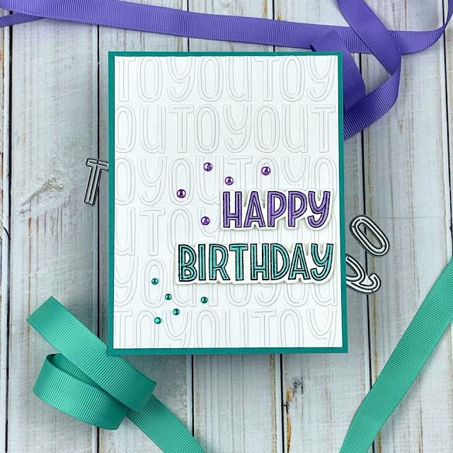
Alphabet dies are so handy to have around. Of course, you'll use them to spell out sentiments and page titles, but what about a nifty background? On this simple birthday card, I started by stamping the Happy Birthday outline. I colored the Happy with a purple marker and the Birthday with a turquoise. Next, I used the matching dies in the set to cut out each word. Then I wanted to do something really different in the background, so I die cut To You 10 times and glued it onto 4.25" x 5.5" card front over and over.
I used some Post-it Tape to both hold my card to my glass mat, and give me a baseline to lay the letters against. I wanted to mat the To You white background to a colorful piece of cardstock so I trimmed off a bit of the edges to make it 5.25" x 4" which really emphasized the repeating pattern.
Finally I adhered the Happy Birthday onto my To You layer using pop dots to make it stand out. I finished it off with some bling to give it a little oomph. White space on a card is really easy on the eyes, and giving it some texture is often a great idea.
Thanks for checking in on my blog today. I hope you get to create something fun today.
Ingredients:
CS: Stampin' Up! Whisper White (white letters), Neenah Classic Crest Solar White 110lb (colored sentiment), Stampin' Up! Bermuda Bay
Stamps and dies: Poppystamps Marzipan Greetings Stamp and die set
Markers: 1 purple Copic, 1 turquoise Copic
Embellisments: purple from my stash, turquoise is Poppystamps Christmas Fairy Jewels
Alphabet dies are so handy to have around. Of course, you'll use them to spell out sentiments and page titles, but what about a nifty background? On this simple birthday card, I started by stamping the Happy Birthday outline. I colored the Happy with a purple marker and the Birthday with a turquoise. Next, I used the matching dies in the set to cut out each word. Then I wanted to do something really different in the background, so I die cut To You 10 times and glued it onto 4.25" x 5.5" card front over and over.
I used some Post-it Tape to both hold my card to my glass mat, and give me a baseline to lay the letters against. I wanted to mat the To You white background to a colorful piece of cardstock so I trimmed off a bit of the edges to make it 5.25" x 4" which really emphasized the repeating pattern.
Finally I adhered the Happy Birthday onto my To You layer using pop dots to make it stand out. I finished it off with some bling to give it a little oomph. White space on a card is really easy on the eyes, and giving it some texture is often a great idea.
Thanks for checking in on my blog today. I hope you get to create something fun today.
Ingredients:
CS: Stampin' Up! Whisper White (white letters), Neenah Classic Crest Solar White 110lb (colored sentiment), Stampin' Up! Bermuda Bay
Stamps and dies: Poppystamps Marzipan Greetings Stamp and die set
Markers: 1 purple Copic, 1 turquoise Copic
Embellisments: purple from my stash, turquoise is Poppystamps Christmas Fairy Jewels

My snowflake dies are put away and my red and green cardstock is filed. Now is the perfect time to start on birthday cards for the month and the year. I am on the Poppystamps blog today as part of the monthly challenge team and our theme is birthday cards. I used some of my favorite Whittle dies to create this punny card.

I cut the two hippos from some blue cardstock. The innertube die which is part of the Floating Hippo die, I cut with the same pink as the flamingo.

Then I layered everything and glued it together. I wanted to keep the color scheme tight so I only used two colors of cardstock along with white. I die cut the Poppystamps Marzipan Alphabet letters from the same two colors.
My snowflake dies are put away and my red and green cardstock is filed. Now is the perfect time to start on birthday cards for the month and the year. I am on the Poppystamps blog today as part of the monthly challenge team and our theme is birthday cards. I used some of my favorite Whittle dies to create this punny card.
I cut the two hippos from some blue cardstock. The innertube die which is part of the Floating Hippo die, I cut with the same pink as the flamingo.
Then I layered everything and glued it together. I wanted to keep the color scheme tight so I only used two colors of cardstock along with white. I die cut the Poppystamps Marzipan Alphabet letters from the same two colors.

I just love a good card challenge (or two, or three). I decided to make a card to enter both a MFT Stamps challenge and the Color Throwdown Challenge this week. The MFT Challenge called for a mini slimline with the measurements of 3 x 6". I've only made two of these before, so I was up for the challenge again. Color Throwdown asked for using bright pink, bright turquoise blue, bright lime green and black. This adorable van and surfboard from MFT's Sunny Vibes stamp set was going to be perfect (and a world away from all the Christmas stuff I've been making).

I am a giant fan of Inge Groot, one of the members of the MFT Design Team and an amazing card maker. Check out her excellent work here. I wanted to use her style of a white background and then plenty of colorful layers. I colored the van and surfboard with alcohol ink markers and simply skipped the items that would not have been one of the 4 colors in the challenge, hence why the tree trunks are white and not brown (an Inge Groot trick). I noticed that if I put the van down onto a white square it was really going to be white on white. So, I lightly inked the white square with Tumbled Glass Distress Ink to create some definition while still keeping to my color scheme. I glued down two die cut trees and then popped up the van/surfboard image on a die cut stitched square.
To create more color I added two more die cut squares (the blue is a little larger) sticking with my color scheme. To work the black in, I added a fishtail banner straight down the center of the card with a black and white polka dot paper. Then I used a sentiment strip popped up off a striped black and white scrap for more definition.
I was very pleased with how I worked all my colors together. I could get very used to this little format.
Challenges I'm entering: MFT Slimline Challenge, Color Throwdown Challenge ctd#672
Ingredients:
CS: Neenah Classic Crest Solar White 110lb
Stamps: Sunny Vibes by My Favorite Things
Dies: Sunny Vibes by My Favorite Things, Stampin' Up! Stitched Shapes, Art Impressions Nested Stitched Squares
Patterned Paper: Black & white polka dot by The Paper Studio, Poppin' Polka Dots by MFT Stamps, blue stripe is Stampin' Up! designer series paper (retired), black and white stripe is from the My Bright Life 6x6 paper pad by Jen Hadfield Home Made by American Crafts
Embellishments: Clear Wink of Stella on headlamp, Sentiment Strip by Paper Roses Black & White Sentiment Sheets
Markers: Copic, Spectrum Noir & Dick Blick
I just love a good card challenge (or two, or three). I decided to make a card to enter both a MFT Stamps challenge and the Color Throwdown Challenge this week. The MFT Challenge called for a mini slimline with the measurements of 3 x 6". I've only made two of these before, so I was up for the challenge again. Color Throwdown asked for using bright pink, bright turquoise blue, bright lime green and black. This adorable van and surfboard from MFT's Sunny Vibes stamp set was going to be perfect (and a world away from all the Christmas stuff I've been making).
I am a giant fan of Inge Groot, one of the members of the MFT Design Team and an amazing card maker. Check out her excellent work here. I wanted to use her style of a white background and then plenty of colorful layers. I colored the van and surfboard with alcohol ink markers and simply skipped the items that would not have been one of the 4 colors in the challenge, hence why the tree trunks are white and not brown (an Inge Groot trick). I noticed that if I put the van down onto a white square it was really going to be white on white. So, I lightly inked the white square with Tumbled Glass Distress Ink to create some definition while still keeping to my color scheme. I glued down two die cut trees and then popped up the van/surfboard image on a die cut stitched square.
To create more color I added two more die cut squares (the blue is a little larger) sticking with my color scheme. To work the black in, I added a fishtail banner straight down the center of the card with a black and white polka dot paper. Then I used a sentiment strip popped up off a striped black and white scrap for more definition.
I was very pleased with how I worked all my colors together. I could get very used to this little format.
Challenges I'm entering: MFT Slimline Challenge, Color Throwdown Challenge ctd#672
Ingredients:
CS: Neenah Classic Crest Solar White 110lb
Stamps: Sunny Vibes by My Favorite Things
Dies: Sunny Vibes by My Favorite Things, Stampin' Up! Stitched Shapes, Art Impressions Nested Stitched Squares
Patterned Paper: Black & white polka dot by The Paper Studio, Poppin' Polka Dots by MFT Stamps, blue stripe is Stampin' Up! designer series paper (retired), black and white stripe is from the My Bright Life 6x6 paper pad by Jen Hadfield Home Made by American Crafts
Embellishments: Clear Wink of Stella on headlamp, Sentiment Strip by Paper Roses Black & White Sentiment Sheets
Markers: Copic, Spectrum Noir & Dick Blick


Except for the sweet MFT figures, I custom created every die cut myself on my Silhouette Cameo 2. The background is using Distress Oxide inks blended together. All the coloring was done using alcohol markers. I printed the sentiments from my PC using a font called Libel Suit. The shaker elements are a mix of several things.
I am entering this into the MFT Sketch Challenge.
Ingredients:
CS: Neenah Classic Crest Solar White 110lb, lightweight CS for computer printing, light blue and glitter paper from my stash; acetate sheets
Stamps: MFT Stamps Warm Hugs & Frosty Kisses
Dies: MFT Stamps Warm Hugs & Frosty Kisses, all other shapes were custom created on Silhouette - no downloaded files
Ink: Memento Tuxedo Black, Distress Ink Tumbled Glass, Distress Oxide Faded Jeans and Shaded Lilac
Markers: Copic, Dick Blick, Spectrum Noir Tri-blend Dull Green Blend,
Embellishments: Shaker - a combination of Recollections Specialty Christmas Glitter Snowflakes, Dress My Craft White Sunshine Sequins and Czech Seed Beads in Canadian White by John Bead; Uniball White Signo Gel Pen, mini jingle bells from craft store, ribbon, baker's twine, foam tape
Except for the sweet MFT figures, I custom created every die cut myself on my Silhouette Cameo 2. The background is using Distress Oxide inks blended together. All the coloring was done using alcohol markers. I printed the sentiments from my PC using a font called Libel Suit. The shaker elements are a mix of several things.
I am entering this into the MFT Sketch Challenge.
Ingredients:
CS: Neenah Classic Crest Solar White 110lb, lightweight CS for computer printing, light blue and glitter paper from my stash; acetate sheets
Stamps: MFT Stamps Warm Hugs & Frosty Kisses
Dies: MFT Stamps Warm Hugs & Frosty Kisses, all other shapes were custom created on Silhouette - no downloaded files
Ink: Memento Tuxedo Black, Distress Ink Tumbled Glass, Distress Oxide Faded Jeans and Shaded Lilac
Markers: Copic, Dick Blick, Spectrum Noir Tri-blend Dull Green Blend,
Embellishments: Shaker - a combination of Recollections Specialty Christmas Glitter Snowflakes, Dress My Craft White Sunshine Sequins and Czech Seed Beads in Canadian White by John Bead; Uniball White Signo Gel Pen, mini jingle bells from craft store, ribbon, baker's twine, foam tape

